No products in the cart.
A Conversation with Adam Mosca aka “Dispraze”, a Hip-Hop Artist
Adam Mosca, better known by the stage name Dispraze, is an Australian Hip-Hop artist from Hobart. He was introduced to...
No products in the cart.
Benita started creating book covers when she self-published three of her own books and realised that indie books deserve to look just as gorgeous and professional as books from big publishers, because they have amazing stories to tell. (And we all know we do judge books by their covers.) Aside from helping authors produce gorgeous books, she also love thunderstorms, flowers, fairy tales, Dutch food, and Regency England.

The art of small talk.
Late morning, except when I work full days at my external job – then I design in the evening.
Absolutely introverted (I have literally climbed out my window to avoid talking to people).
I don’t watch anime but my favourite movie is the 2015 live-action Cinderella!
To the past, specifically the time Jane Austen lived.
“Questions to ask to design a logo” – I was working on the questionnaire I send to logo design clients.


Fantasy art, because it’s always so creative and vivid.
Out of nowhere my roommate wrote me a really sweet letter telling me all the things she loved about me!
Kirk DouPonce, Megan McCullough, Maria Spada, Azullyn …


Vibrant.
Whenever I look back at a past book cover I see a detail I could’ve or should’ve added.
Kirk DouPounce’s book covers for Dust and Shadow by Kara Swanson.
You’ve answered our rapid fire so well, Benita. Now, it’s time for our readers to know more about the person behind the designs.
I studied philosophy and the humanities in university because I love intellectual discussion, logical arguments, and thinking about the big questions, but I also laugh inappropriately hard at memes that make absolutely zero sense, specifically because they are meaningless. (Google “surreal memes”.)

Every time I see a gorgeous book cover (especially fantasy) it gets me imagining how I could incorporate what I love about it into a brand new work. And sometimes movies will do the same – I created one premade book cover based on a landscape in the “A Whole New World”scene in the live-action Aladdin movie.
Specifically for book cover design, typography can make or break a book cover. I’ve seen covers with absolutely incredible photo manipulations but the typography doesn’t fit. It totally takes away from the effect. The text needs to be part of the image, not just sitting on top of it, if that makes sense!
Not specifically, though sometimes an author will ask me to include a certain detail that readers might not notice. But sometimes I spend a ton of time on tiny details within the artwork that nobody would ever notice. For example, I’ll often spend five minutes moving an element of the book cover one pixel to the left, then back to the right, back and forth over and over, because I can’t decide which I like better. It sounds ridiculous but it actually does make a difference (sometimes)! Then there are the other little details within the artwork like small flashes of light, or subtle textures and overlays. It’s those details that make a good cover stunning.
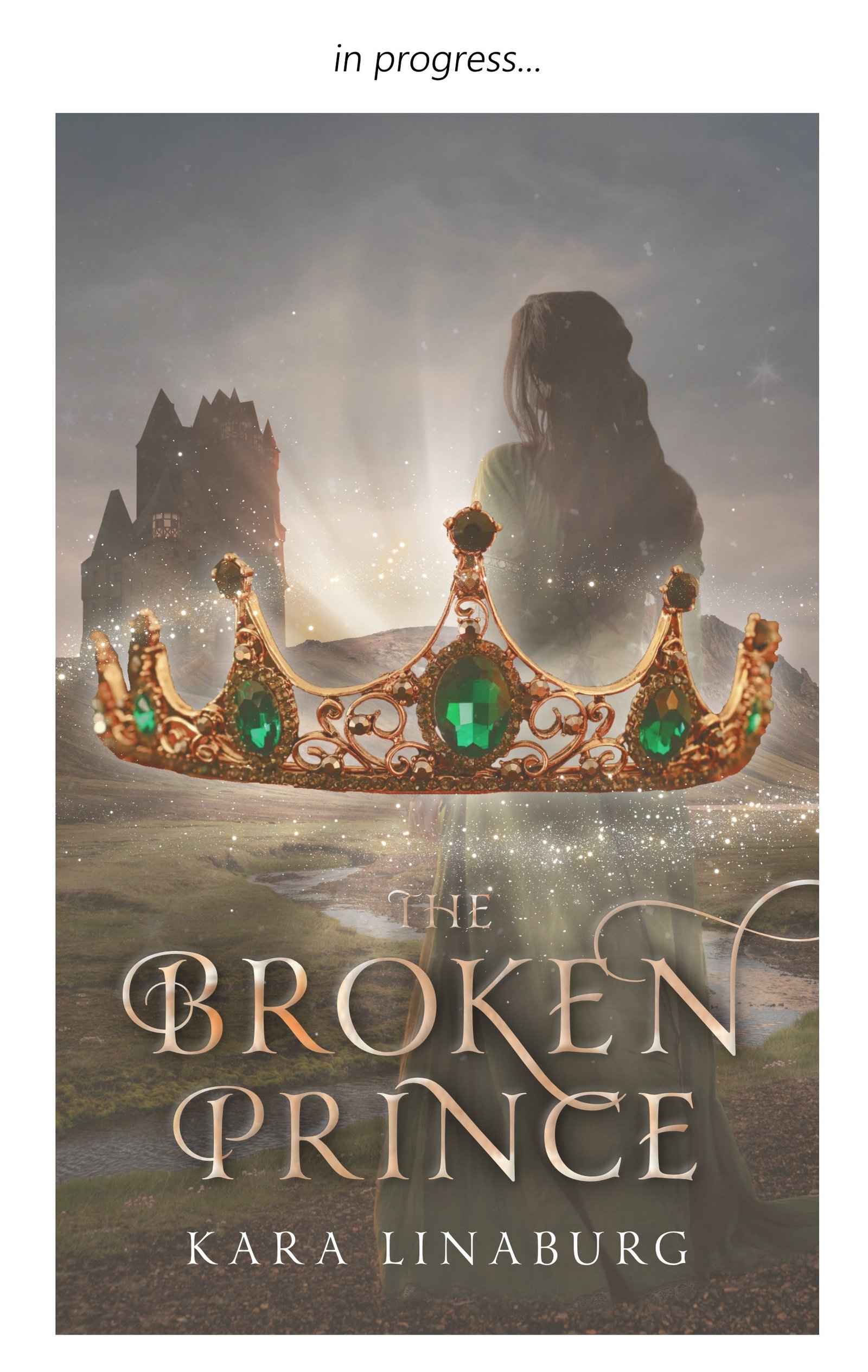
The book cover I made for Kara Linaburg’s The Broken Prince went through five very different versions before I hit on a concept I liked enough to move forward! Usually I get there within one or two versions. The author had given me a wonderfully detailed brief (i.e. what she envisioned for her cover) and there were a lot of directions I could have taken the design, as well as a number of elements to include and a specific vibe to portray. It was definitely a challenge to pull everything together, but I had so much fun and in the end she and I both absolutely loved what we came up with.
I have a huge soft spot for fairy tales, and that comes across in my designs with lots of sparkles, glowing light, and deep vibrant colours. A number of people have commented on how magical some of my covers look, which is exactly what I’m going for!
My clients start by filling out a detailed questionnaire about their book and their vision. They also tell me some “comp titles”, which means published books that are similar to their own. I don’t read their books, but their answers give me a strong sense of what their book is about and what kind of cover they’d like. I look at similar books and what the conventions are for book covers in that genre. Next, I mesh all those things together and come up with a mental sketch of what the cover might look like. After that, it gets a bit haphazard! I start by bringing my mental sketch to life using photo manipulation, but things always change a lot during that phase. I just experiment with different ideas that pop into my head until I like the result. Then I send the author my draft, they give me feedback, and I keep revising until they’re totally satisfied.

In a nutshell, I’m happy when my clients are happy. But to go into more detail, I have a couple gauges for success in my projects. I’m passionate about self-published books looking just as stunning and professional as any traditionally-published work, so first and foremost I need to be confident that my work meets both those criteria. Within that framework, the book cover also needs to fulfill the author’s vision—it’s their book, after all! So I always double and triple check the brief they sent me to make sure I’ve incorporated everything they were looking for.
Every now and then, the author’s vision might clash a bit with the established expectations for professional book covers in their genre. That’s actually when I have the most fun, because I get to figure out how to reconcile the two (which are both incredibly important)! It’s like a puzzle. How can I incorporate this element that the author really, really wants in a way that works with the genre expectations? When I find the right answer to that question, I consider those my most successful projects.
I follow a bunch of super talented designers on Instagram, people who specialize in book cover design and some who do more general design. I’ve seen so many new styles of art and typography that I’m desperate to try out. My folders of saved posts are enormous! On the practical side, if I’m designing a cover in a genre I’m not as familiar with, I like to take a look at the most popular books in that genre on Amazon and Goodreads. I get a great sense of what the expectations are and I often find myself inspired, too.
I’m a procrastinator extraordinaire, so deadlines are my favourite because they keep me on track. The pressure works in my favour by forcing me to get started and keep going. Once I’ve begun working, I often become so absorbed that I lose track of time. (I’ve worked on a cover for six hours straight without even realising it till afterward!)
Like I mentioned above, I make a point of following other designers on social media. Since I’m self-taught as a designer, seeing other people’s work is both inspiring and educational. Imitation is a great learning tool! Practicing my art by imitating what other, more experienced designers are doing has taught me so many tips and tricks that I can incorporate into my original designs. I also take online courses from time to time to develop specific skills like photo manipulation, colour theory, typography, and so on. One other big thing I do is watching timelapse design videos on YouTube. I have learned so, so much by watching other designers’ processes, and it’s also just great fun to see a book cover come together from start to finish!
I have so many tips but I’ll limit it to four for now! First, immerse yourself in design by looking at other people’s work and figuring out what you like and don’t like about it. (I strongly recommend watching timelapse design videos like I mentioned above.) Second, learn typography! I can’t emphasise this enough, because text is an essential part of a book cover and missing the mark there can mess up the entire cover, no matter how good your imagery is. Third, research the genre expectations. If a thriller has a gorgeous cover but it makes readers think they’re about to read a romance book, that gorgeous cover is still failing to do its job. The cover’s purpose is to tell the reader what they can expect to find inside. Finally, practice a ton. Whether that be by copying other book covers you like (obviously for practice only, not ever to sell!), making new covers for your favourite books, or whatever other techniques you find, just practice creating covers that fit the stories inside.
Adam Mosca, better known by the stage name Dispraze, is an Australian Hip-Hop artist from Hobart. He was introduced to...
Katelyn Groombridge's cover design journey came from years and years of dabbling in all things art and creativity, everything from...
Juan Pitluk is a 3D modeler, texturer and animator. Juan lives in Buenos Aires, Argentina, with his family. He has...
Ola Snimshchikova is an illustrator and concept artist from Kyiv, Ukraine. She graduated with a masters degree in Animation from...

Where Trends are made and discovered
Trenzle is your official source of discovering the latest people, work, and ideas that deserve to trend. Discover Authors and their books, Creators and their work, People and their opinions, and Stories from around the globe.
Learn more
© 2023 Trenzle - Online Author News & Magazine